

 |
||
|
World Map in Local Languages 
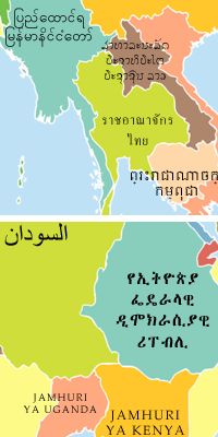
Aside from their geographical limitations, most maps have a huge linguistic bias. A world map represents a global consensus of political and geographical boundaries which everyone can recognize, but none of them (that I could find) represent a linguistic consensus--i.e., country names as written by their own residents. This was an attempt to create a written map that is equally useful (or unuseful, as the case may be) for everyone. Anyone, anywhere in the world can say, "This is my country, and my country's name." Although many countries have more than one official language, a design decision was made to limit each country to one name. The general rule was to use the official language with the highest percentage of regular speakers, though there are several exceptions. In cases where an official language appears largely governmental, and is not spoken by the vast majority of citizens, an unofficial majority language was used. However, in places with many languages where there is no clear majority tongue, I defaulted back to the official language. This was particularly prevalent in Africa, with hundreds of different languages and mutually unintelligible dialects. English and French are common official languages, although not necessarily spoken by many natives. The result probably won't end up in any travelers' hiking packs, but it is an intriguing look at the distribution of dominant languages (and scripts) throughout the globe. Comments and corrections are welcome. There are two different maps available--both long and short versions of country names. Each has 3 different sizes, though many names are not legible at the small size. PNG files are higher quality than JPG.
|


